Plotting PUMAs in R
If you work with any Census Bureau data, you are probably familiar with Public Use Microdata Samples (PUMS) from the American Community Survey. These are individual records (either person or household) that allow data users more customized analysis than would be available with the ACS tabulated data products. In order to preserve confidentiality, the geographic information in this data is limited to the Public Use Microdata Area (PUMA). This is a custom geographic area that nests within state and is defined in such a way that each PUMA contains at lease 100,000 people.
When working with PUMS data, it is often desirable to create a map as a visualization tool, which is the main goal of this post. To begin, the pumas() function in the tigris package can be used to easily download PUMA shapefiles. I will demonstrate for the state of Missouri.
library(tigris)
pumasMO <- pumas("MO", cb=T)
The argument cb=T is used to download a general shape file rather than a high detail one.
class(pumasMO)## [1] "sf" "data.frame"Note that this object has the class sf and data.frame. This is a standard “tidy” data format that will easily allow us to present the data using ggplot.
Next, we read in the PUMS data that we are working with.
library(readr)
pumsMO <- read_csv('psam_p29.csv')
For simplicity, I am just going to count the number of sampled individuals within each PUMA, which I will later plot.
library(dplyr)
pumsMO <- pumsMO %>% group_by(PUMA) %>% summarize(Count=n())
str(pumsMO)
## tibble [47 × 2] (S3: tbl_df/tbl/data.frame)
## $ PUMA : chr [1:47] "00100" "00200" "00300" "00400" ...
## $ Count: int [1:47] 2543 1432 2015 1775 1674 1372 2331 1977 1026 964 ...The final step is to join the PUMS data that we want to plot with the tidy PUMA data that we created earlier.
plotDF <- pumasMO %>% left_join(pumsMO, by=c("PUMACE10"="PUMA"))
str(plotDF)
## Classes 'sf' and 'data.frame': 47 obs. of 10 variables:
## $ STATEFP10 : chr "29" "29" "29" "29" ...
## $ PUMACE10 : chr "00400" "02400" "00700" "00600" ...
## $ AFFGEOID10: chr "7950000US2900400" "7950000US2902400" "7950000US2900700" "7950000US2900600" ...
## $ GEOID10 : chr "2900400" "2902400" "2900700" "2900600" ...
## $ NAME10 : chr "Lincoln, Warren, Audrain, Pike & Montgomery Counties" "Butler, Ripley, Wayne, Madison, Iron, Reynolds & Carter Counties" "Pettis, Randolph, Saline, Cooper, Howard, Carroll & Chariton Counties" "Boone County" ...
## $ LSAD10 : chr "P0" "P0" "P0" "P0" ...
## $ ALAND10 : num 7.65e+09 1.15e+10 1.14e+10 1.78e+09 1.41e+09 ...
## $ AWATER10 : num 1.23e+08 8.78e+07 1.43e+08 1.42e+07 1.48e+07 ...
## $ Count : int 1775 1174 2331 1372 879 2015 1215 1202 1441 1725 ...
## $ geometry :sfc_POLYGON of length 47; first list element: List of 1
## ..$ : num [1:500, 1:2] -92.3 -92.3 -92.3 -92.3 -92.3 ...
## ..- attr(*, "class")= chr [1:3] "XY" "POLYGON" "sfg"
## - attr(*, "sf_column")= chr "geometry"
## - attr(*, "agr")= Factor w/ 3 levels "constant","aggregate",..: NA NA NA NA NA NA NA NA NA
## ..- attr(*, "names")= chr [1:9] "STATEFP10" "PUMACE10" "AFFGEOID10" "GEOID10" ...Now we can make a map that shows the areal data we are interested in.
library(ggthemes)
ggplot(plotDF)+
  geom_sf(color='black', size=0.3, aes(fill=Count))+
  theme_map()+
  scale_fill_gradientn(colors=topo.colors(10))+
  ggtitle("PUMS Sample Size by PUMA")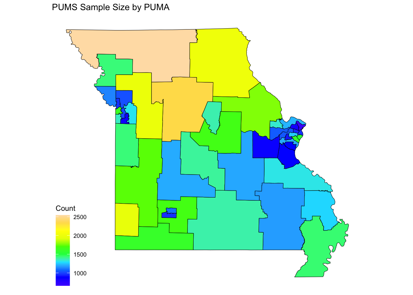
Paul A. Parker
Assistant Professor
My research interests include Bayesian methods, especially when applied to dependent data scenarios, often using survey data.